The Idea
Inflection was conceived as a new force in the aerospace industry, a company redefining how innovation, technology, and design coexist in space systems. The brand needed to feel forward-thinking and sophisticated while communicating clarity, precision, and motion. The goal was to create a visual identity that captured Inflection’s essence: the point where change begins.
The Challenge
The main challenge was translating a highly technical, space-focused vision into a brand that feels human and approachable without losing its sense of innovation and authority. It had to stand apart from the cold, corporate aesthetics common in the sector while still resonating with engineers, partners, and investors.
The Solution
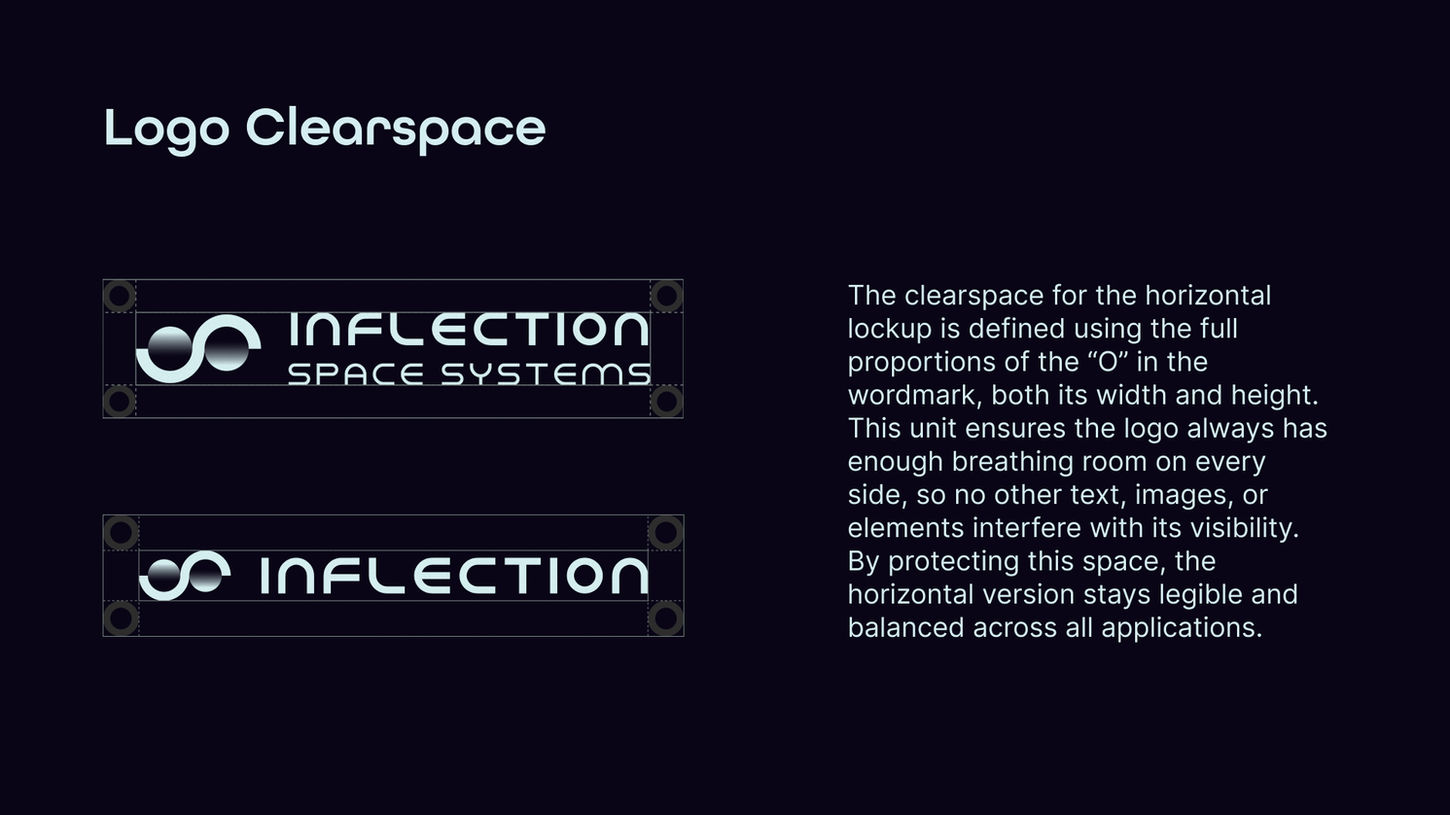
Inflection’s identity was built around the idea of transformation, a balance between precision and disruption. The brand combines the clarity of engineering with the emotion of innovation, creating a visual language that feels both advanced and approachable. The color palette, drawn from the boundary between Earth and space, reflects the brand’s connection to exploration and change. At its core, the logo embodies this philosophy through two disrupted circles forming a symbolic inflection point, representing motion, progress, and the moment where direction shifts toward something new.


